Visit without Spotlights
Two
years after opening, with plenty of accolades on the design and unanimous criticisms on the workmanship, I went to Guangzhou to visit the opera house with relative
cool head. The public attention has gone
but the review with less hype would only do justice to all.
A
comforting reassurance to able architects, I have had the experience most of
them would love to hear - that is the concept of the project is manifest
visually before the eye through its architecture. The subversive thought of
unreadable architectural concepts in most buildings does not apply in this
occasion.
To
be fair with Zaha Hadid’s efforts, the above observation is pure
incidental. I have never read any critique
on this project prior to the visit. At
the same time, I must declare to be a non-believer of deconstruction architecture
and even after writing this article, I am not a particular fan of her.
Aerial
view with an array of landmarks and
the Pearl River bank towards the south.
A Visual Concept
According
to its architect, the opera house had its inspiration from the Pearl River, which
is the source of drinking water and a host of activities for the inhabitants of Guangzhou.
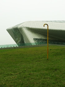
With the biomorphic forms akin to two
giant pebbles drifting ashore along its bank, the two expressive looking performance
venues incite comparison with scholar rocks, which are much adored by the
locals.
Almost
imprinted in the psyche, the appreciation of
unusually shaped rocks in China, or suiseki
in Japan, has a long tradition in the Orient.
unusually shaped rocks in China, or suiseki
in Japan, has a long tradition in the Orient.
(photo
∣ www.bonsaitonight.com)
From
top to bottom: Level One, Level Two, High level plan
and Section through the
grand auditorium.
(drawings ∣ www.zaha-hadid.com)
Formalistic
layout of the new Guangzhou CBD centred along
the grand boulevard that is
terminated with
two iconic buildings towards the south.
(photo
∣ www.lifeofguangzhou.com)
Given
that the Guangdong Museum, strategically located with the opera house as a pair
of new cultural icons perpendicular to the central axis, has the same plateau-cum-main
building arrangement. It can only be
deduced that the setting was a predetermined criterion for both competition
briefs. All said, the analogy of prized
stones rested above a river bank is conceptually viable as an installation. In the eyes of the Cantonese, it easily make
image associations pertinent to the school of Lingnan still life wash paintings.
Luxembourg
Opera House in 1997. Though not
materialized,
it might have laid foundation for the more mature
Guangzhou
project in 2003-2010.
(images
∣ www.ademirvolic.com)
Nudging Tensions
Daunting
to view at first instance with the low lying concrete masses, the opera house
is surprisingly easy to orientate and navigate.
As the site faces south and the main approach comes from the north,
Hadid did a skillful job of channeling pedestrians either from east and west
via underpasses, steps or ramps. People
are easily directed to the foyers where the solid stone shells are punctuated with
irregular stripes of glazing and entrances.
The
two performance buildings of grey and white, their volumes reflecting the
programme of housing a formal auditorium of opera and small scaled experimental
theatre, are raised on a platform of circulation routes, entrance foyers and
ponds. The two “pebbles” create
interesting solid and void relationship, the resultant tension are compelling. Apart from the main cast, other public
facilities especially the catering venues and exhibition space are though too dispersed
and not strategically located.
A
photographer may find it hard to shoot
the Guangzhou Opera House. The building has one of
the most unusual
building expressions to be captured but
the result seems to be far from
desirable.
Disconcerted neighbours
On
another sour note, the relative tight plot for a grand project of this scale
has one particular drawback – the amoebic buildings with interesting nooks and
crannies are blocked by the high plateau ground floor at certain angles. Worse still, the nearby tall buildings incongruously
standing among themselves, are in complete discordance with it. Their close proximity leads to the unspeakable
thought that the opera house might be better built somewhere else.
Glimmering Inside
Interiors
of two performance buildings provide fluid flow of spaces that are breathtaking
but somehow expected of.
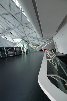
Public
galleries with triangular shaped fenestrations
cast different shades of light
and
darkness depending on the time of day.
Perhaps
due to the triangulated structure that captivates
the eye, the glazing does not induce view out of the building envelope. It generates certain introverted countenance.
the eye, the glazing does not induce view out of the building envelope. It generates certain introverted countenance.
In
stark contrast to the monochromatic exterior, the grand theatre is painted with
gold on walls and ceilings. Together
with the velvety red chairs, they suggest that the architect is determined to appease
local tastes. It is a pleasant
encouragement to find a bold enough architect like Hadid to consciously apply colour
to architecture, inside or out. While
the public foyers are fragmentary and angular, the voluminous auditorium is fluid
and cavorting with streamlined plastering.
Views
of the Grand Theatre
The scaled walls, apart from fulfilling
acoustic needs, reinforce the idea of triangulation on the structure. The interior, as remarked by the tour guide, further
hints at the presence of the carcass of a giant fish. The metaphors of pebbles, fish scales and carcass
can be tied together under the tradition of the maritime theme. Both methodologically and thematically
speaking, this radical stream of architecture, no matter how progressive it
appears, cannot shake away inherently from the language of Modern Movement.
Views
of the Rehearsal Room
Tokenistic
design of lavatory in black and white that
do not aspire to much quality.
Worse
still is this door design that would be
better off with conventional detailing.
Awkward-looking
stonework at front corner. It is the
setting-out by the designers not the resulting
workmanship that calls for
improvement.
Analyzing Charges
The
construction quality of this project is laden with criticism, in my understanding,
many of which are unjustified against the contractors. With a highly irregular shape on the exteriors,
the segmentation of cladding into triangular pieces did not resolve properly all
the geometrical surfaces of the enclosures.
It is often noticed at pointed protrusions and awkward indentations that
the stone cladding patterns seem to stray.
This has to do more with the setting-out by the design team rather than the
workmen.
Restaurant
spaces in the form of paddy fields
according to the designers.
There
was apparently a misunderstood intent between the architect and the
client. A restaurant space outside
theatre could be a success in other projects.
However with performance not scheduled on a daily basis, any dining
facility high above in the building would be a challenge to customers. The purpose design space has thus been left
vacant since the building was open in 2010.
Black
box theatre interior is unassumingly lacking in design and size compared with
other high-profiled interior spaces.
Interesting
space and light sources that are not
used to the fullest.
There
is the creeping issue of maintenance that seems to be overlooked by the
designers such as the replacement of defunct LED lights at the high ceiling of
the grand theatre, broken exterior glazing at unreachable surface and water
seepage with no control of where water might flow.
Unacceptably
bad craftsmanship and installations that
the three-party-relationship of architect,
contractors and client must share criticism.
Of
course there are the badly applied sealant joints, haphazard cladding and
missing finishes at odd corners that could have been prevented by the contractors. The fledgling property management of this
building and those in other parts of China, all the more, exacerbates its inadequacies
especially related to the venues’ unique features and construction technology.
Artworks at a Glance
No doubt the best artwork at the opera house. “Dreams of the White Collars” (白領之夢) by Ma Han (馬晗) uses white shirts to ignite both
thoughts and sensations. It is fragile
and temporal, two values that interact well with the triangulated curtain wall
of the background.
We
were told during the architectural tour that
the origins of some artworks from
overseas could not be traced. Besides
having no titles and attributions,
some of them are real oddities in the
context.
Deconstructing Architecture
The
exhibition of “Deconstructivist Architecture” at MoMA, 1988 marked the beginning
of massive attention from students, architects and the public on the new
expressions.
(images
∣ www.ahrachodesign.com)
Time
has proven itself that the movement of Deconstruction Architecture has crumbled;
and its protagonism is an event of the past.
The theoretical basis of semiotic analysis under the philosophy of Deconstruction
applied to architecture has demonstrated to be unsustainable. The operators of the two disciplines can
hardly be transcribed. If it was a disapproval
against Post-Modern Classicism of the 1980s, the exercise has succeeded in
making a stance and the pastiche architectural movement had itself run out of
steam. If it was a reaction against the
modernist dogmas like functionalism and other dead-end parameters, the revolt sparked
many debates.
When
looking at Deconstruction under a condensed time span, it may be better merited
as an architectural development process rather than an end in itself. The loosely connected characteristics of its
architects in play of fragmentation, distortion and controlled chaos defy
tradition for the sake of anti-tradition.
Their disdain for form-making only results in another version of
form-making.
With
projects consuming much more than others, these architects do not aspire to
lofty ideals or clear goals. Since the budgets
of such buildings are many times their conventional counterparts, they are
often seen as elitist. For public
buildings including the Guangzhou Opera House, these high-profiled developments
might help serve social and political intents by means of glorifying the ruling
regimes.
In
my opinion, the Guangzhou Opera House as a stand-alone piece of work is undoubtedly
a success. It has the lyrical simplicity
and abstraction other heavily contrived works
under the name of deconstruction do not
possess. However, beauty is
not the only virtue, we do not live in an
era of isolated values. Far from this
case, architecture today are often exploited
to serve social, economic and even political ends,
none more so than these deconstruction buildings. The glamorous architectural profession has
been developed into an operation of money-can-buy existence. Most of these
high-profile buildings are relegated as consumables and its architects
as mere tools.
哈廸唱和廣州大劇院 〈中文摘要〉
附和與偏見
啓用已兩年的大劇院聚焦了以下標準反應:一,對哈廸(Zaha Hadid)的設計高度讚譽、二,對施工質素強烈評擊。我不是哈廸的追隨者,亦非傾慕於解構建築。沒有這些包袱,我抱着平常心檢視這建築。
目視這概念
在沒有閲讀任何報導下,這初次參觀明顯地體會到〝雙石畔岸〞的意念,設計師的構思具高度的可閲性。除了追逐西方建築思維,這造型亦為嶺南人投射觀賞石的感覺。
這兩個大小不一、形狀多變的表演場館有着引人入勝的張力。遺憾的是它們座落的高台布局卻產生不少視覺障礙。而附近不協調的高層樓宇,錯落無序,最少令拍友苦腦於攝影構圖。
閃爍的劇塲
與黑、白及灰調的外觀比較,大劇院室內泛金色的牆體和天花、天鵝絨紅的坐椅,既耀目亦譜出本土色彩。大堂的棱角性及散亂美學亦與劇塲的環迴流動空間相映成趣。眾觀哈廸的異樣設計,可是她引用石頭、魚鳞及鯨體的海事主題,並不能逃避對現代主義的燻陶。
質量和指控
施工上的批評,以我個人的專業認識,大多缺乏公允。反之,考慮項目的難度、經觀察實物,施工隊伍算是稱職。外牆部份掛石效果欠佳,全屬設計師工作範圍,與建造水平無關。至於現存高空維修難題,包括電燈、破窗及漏水,建築師的責任不比施工方低。當然,硅膠亂塗、葢板欠妥、修口處理等顯然易見是施工缺陷,監管不週。而劇院管理的不善,在衆多細節表露無遺,絕對有改進空間。
解構中建築
時間証明解構建築這運動已自我崩堤。倡導的潮流已成過去式。當初引用解構哲學去解釋這建築方向完全不能持久,文字符號與建築學的操作互用條件並不高。
在耗費大量資源的前設上,解構建築師往往缺乏理想和目標。他們的作品只流於過度精英。一如這劇院,因為外貌標奇立異,這些建設很容易被利用成歌頌權力的器具。
平衡各方思絮,廣州大劇院無疑是成功的。它的雅緻及抽象,有點石成金之效,亦為一般表達剛烈、流於皮相的解構建築所沒有。光是漂亮也不中用,我們已不是生活在孤立的價值觀念層,今天的建築設計很多時被利用,旨於服務經濟甚至政治目的,尤其是耀目的解構項目。它們在權貴中已發展成可買可賣的商品,而建築師則淪為服務權貴的工具。


No comments:
Post a Comment